- Details
- Category: Form Fields
A select list (also known as drop-down list) is a form element that allows the user to select an option from a range of options.
Example:
Usage:
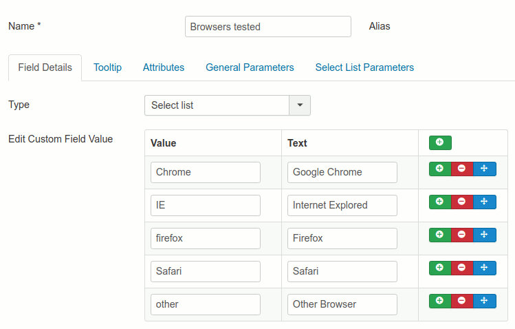
Go to Components → Contact Enhanced → Form Fields, click on the New button, then set the Form Field Type to Select List.
Edit Custom Field Value by adding a new row for each new option. The first option is the field's value and the second is the label.
Start the value with -- (two dashes) in order to create group field.

Select List Parameters

- First Option
- Automatically adds a first option with the
-- Please select one --label - First Option text
- (Optional) The text to replace the first option default text
- Show "other"
- When enabled it replaces the Select list with a text field when the last option is selected
- Show Datalist
- Displays a list based on the select list options in case the user changes his mind and wants to use one of the options from the select list